/ UX Researcher
/ uX UI dESIGNer
/ Graphic Designer

MiRROR

2022

View Prototype

Overview

Mirror clothing is host to more than 400 store-fronts in over 32 different countries around the world. They offer up a one stop shop for both quality goods and budget conscience pricing for everyone. Yet, their main goal is to provide clothing to reflect one’s best self. Unfortunately, Mirror's best self can't be found anywhere online.

Research
COMPONENTS
Secondary Research
Competitive Analysis
Provisional Personas
User Interviews
Research Goals

1 - Determine customer motivations & methods of shopping new online stores.
2 - Understand what is key to customers when purchasing new clothing.
3 - Discover all the pain points for searching & purchasing new clothes online.
4 - Perform direct, indirect competitor analysis alongside user interviews.

I began my research by trying to understand my objective. I conducted some general research on both online & in store clothing companies as a whole. Selecting a new garment online, with limited info can be a little uneasy, almost like a rolling of the dice. The product overall representation and/or feedback for each needs to be detailed, clear & concise.

Competitive Analysis

Next, I began exploring Mirror's competition by conducting a competitive analysis. This helped me gain an overview of other clothing companies, how they display & present their garments. I additionally created some provisional personas as well, based on all the information I gathered. 

Competitive Analysis of Mirror's Competitors
Provisional Personas for Mirror
User Interviews

I chose to conduct interviews to gain further insight into customers’ needs, motivations, pain points, & how exactly they go about shopping for new clothing online. Being sure to include a range of levels, ethnicities, careers, backgrounds, etc. I talked to the following categories:

- People who recently completed purchases of new clothing, be it online or in-store.
- People who have experience shopping for new clothes online.
- People younger in age, like 15 - 35 years of age or more.
- People who have bought clothing from brick & mortar stores.
- People experienced anxiety or stress, from selecting new clothes entirely online.

INTERVIEW RESULTS

- People stressed the importance of a quality reviews section when deciding on a product.
- Most people struggle with fit & sizing, in comparison from brand to brand.
- People agreed that use of filters were key for shopping most efficiently.
- People found different store return policies & procedures were always difficult.
- Everyone wants the online shopping experience to be quick & effortless, like in store.

Define
Components
User Persona
Open Card Sort
Sitemap
Task & User Flows
User Persona

I created a user persona to help represent the user voices from the interviews. This also aided me to stay focused on the user goals, during the later to come design process.

User Persona
Open Card Sort
Additionally, I conducted an open card sorting exercise to understand better how potential users would each categorize the website's content. I gave three participants groupings of cards, then asked them to create their categories, & finally label them as they saw fit.
Open Card Sort Results
Sitemap

It was essential to define how users will interact with & navigate through the website. I then asked myself these key, following questions:

- What pages are the most important?
- How should the content be organized?
- What belongs inside the navbar?

Mirror Clothing Sitemap
Task & User Flows

I built out a task flow to help show how potential users would move through Discord to start a group watch party. In turn this allowed me to further see all the possible steps & decisions an user could or would take along the way. It was key to follow along with Discord's established navigation style.

Mirror Task Flow
User Flow: Online Search
Ideate
Components
Sketch's
Med-Fi Wireframes
High-Fi Wireframes
Sketches

I started the process with sketching out some possible layouts for the homepage. I then explored various ways of organizing the content and structure. In the end, this helped me figure out what the other page’s layouts would be.

Low-Fidelity Sketches of Homepage
Med-Fidelity Wireframes

I created my mid-fidelity wireframes based on elements taken from the home page sketches. I also chose to design wireframes that would assist in completion of the following tasks:

- Finding a selected garment.
- Adding that item to their cart.
- Checking out & purchasing it.

Mid-Fidelity Wireframes

I created my mid-fidelity wireframes based on elements taken from the home page sketches. I also chose to design wireframes that would assist in completion of the following tasks:

- Finding a selected garment.
- Adding that item to their cart.
- Checking out & purchasing it.

Med-Fidelity Wireframes
Challenge

Endless scrolling & searching for main navigation, a search bar or one’s shopping cart can slow down the shopping process.

Solution

An solution was to add both a sticky main navigation bar & chat/help button that follows users along when scrolling through any page. Paired with the search results page feature of a quick view, sort by relevance, filter options & more so to not lose place in browsing. This aids to drastically improve & speed up users' overall shopping experience.

Challenge

Most users interviewed found that customer review sections can be difficult to navigate & find the info they are looking for. This can both slow down users & even result in them leaving w/o purchasing anything.

Solution

The solution was to add a detailed review section on each product details page. Users can sort through these by use of a search bar, inclusion of images or videos, and even by selecting descriptive keywords. Reviews can also be given a thumbs up or down depending on how helpful to them.

Design
Components

Moodboard
Branding
UI Kit
UI Designs

Branding

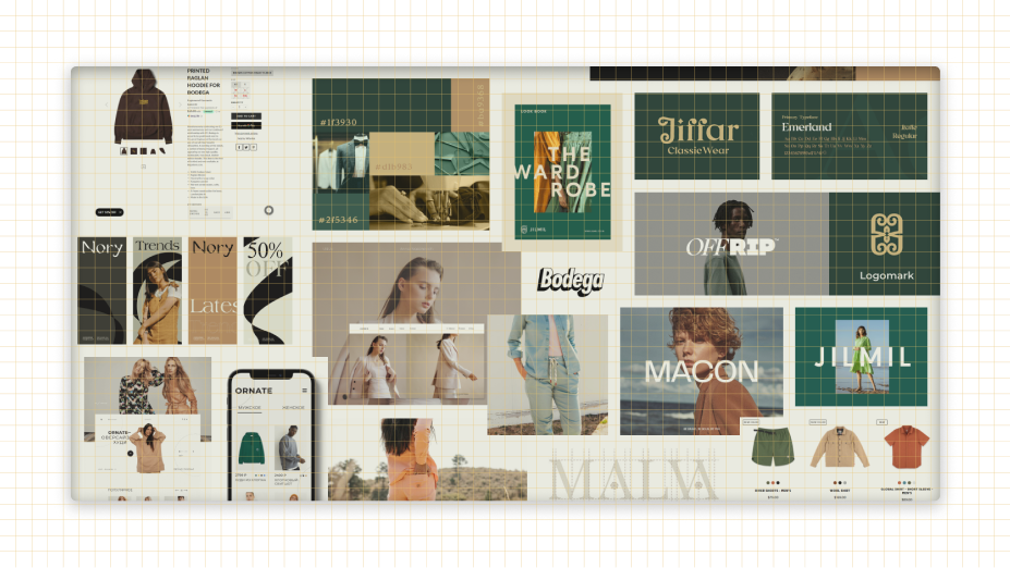
The goal of the Mirror brand was to put focus on a friendly & transparent user experience. I searched for typefaces that would best fulfill that goal during my logo exploration. I picked this customized typeface for the main logo & favicon, in addition to using the elegant, clean & modern Montserrat font family for almost everything else.

Brand Style Tile
Custom illustrations / icons created from scratch with Adobe Illustrator
UI KIT

Following my custom created icons & illustrations, from above, I then constructed an extensive Mirror branded UI Kit. I was still able to keep up a simplified, clean looking aesthetic for the brand with minimal colors being used throughout. This paired well alongside my full color cut-out thumbnails & other images, even further helping them to 'pop' on various pages, as well as remaining the main focus.

UI KIT

Below is my . . .

Mirror UI Kit
Homepage
Results Page

As you can see these one-page checkout screens include minimal wording, content, fields & forms to help speed up the overall checkup process. This declutters & organizes the space into a clear hierarchy, as to not overwhelm prospective users. In addition, to display one's overall progress till checkout is completed.

Nav. Bar Dropdown
Product Detail Page
My Cart Sidebar
Checkout Page - Information
Checkout Page - Shipping
Checkout Page - Payment
Challenge

The ability to quickly navigate through the entire online shopping & online browsing process is a paint point often felt by many users.

Solution

Clicking on a product detail page's five star review up top, above the main product title, will auto scroll users down the page to the customer reviews section location. Additionally, the breadcrumbs also can be used to navigate, but back to other pages that led the user here to this page.

Challenge

Often online stores have a space for the option to save on a first time order through them, as well as keeping them informed. This information can be hard to find & locate, sometimes even missed. 

Solution

The need for a more easily legible & clear promotional banner for visiting customers to view is located just above each page's footer. This being essential so as not to miss it, in addition to being in the rather bright brand main color as well also helps. Not to mention can also be seen right above the sticky main nav bar.

Test
Components

Interactive Prototype
Usability Testing
Affinity Map
Interations

Interactive Prototype

I created a high-fidelity, & interactive prototype in Figma to conduct usability testing, in person as well as through screen sharing. Five participants from various backgrounds, profiles & ages were chosen for the test. I presented each with 3 tasks to complete, then observed progression.

View Full Document
Mirror Usability Prototype Screens
Task 01: Explore The Homepage.

INSTRUCTIONS: "You have just landed on the homepage, please browse it."

NOTES: All the users completed the task with relative ease & speed. They all enjoyed the overall layout, colors & ordering of sections, i.e. the 'Deal Zone' being first up top of page.

Task 02: Find A Men's Shirt In Medium & Forest Green, Then Purchase It.

INSTRUCTIONS: "Please imagine you need to find & purchase a specific forest green men's’ shirt in a size medium. Try to click on the areas you believe will take you to “Topo Designs Bubble Tee” Finally, checkout & purchase the item."

NOTES: This task provided to be no trouble for the participants. All users liked inclusion a hover state change of thumbnail image based on the color options. Additionally, the users enjoyed the quick & easy checkout process, with minimal screens to completion.

Task 03: Find A Yellow Shirt & Save It For Later.

INSTRUCTIONS: "I would like you to find a yellow shirt, on homepage, & save it for later."

NOTES: Everyone located the heart-shaped button & added to wish-list, all liked inclusion of brand color.

. . .
Completion Rate
100%
. . .
Completion Rate
100%
. . .
Completion Rate
100%

View Prototype

Affinity Map

Using an affinity map, I organized the observations & notes from the usability testing. Similarly, as with the empathy map, I looked for patterns, trends to discover insights, & related to then design recommendations.

Affinity Map
Iterations

I made a list of iterations based on feedback from my testing. This made me reflect upon the importance of testing as a part of the design process & how the process is interactive.

Challenge

Users often attribute a good online shopping experience or situation on how straightforward, quick & easy the entire process is for them, from start to finish. 

Solution

Active summary sidebar to accompany users throughout their entire checkout process, as well as the pages in there of. Yet, this whole process is reserved to only three screens. Finally, the entire user progress till complete l throughout can be tracked & navigated effortlessly.

Challenge

The cart icon is usually just a button that takes users to another isolated page. How easily the user flows through the site while shopping can often be a factor of ever completing the purchase.

Solution

The sticky main site navigation bar & CTA chat button at the bottom of the screen aid users as they can not be lost, as they are never too out of reach. Either way this cart icon is also highlighted, with a notation of the number of items currently inside it. This helps users, as they do not need to leave what they are currently viewing to check.

Potential Next Steps

1 - Build out more pages/features for prototype, time & budget permitting.
2 - Conduct another round of usability testing, again if time permits.
3 - Prepare and package all deliverables to hand off with developers.

What I Learned

Coming from a graphic design background, this project taught me the importance of user-centered designs & how to create better products. This is achieved by listening to & understanding my users. I gained valuable insights that led to a favorable user experience just by hearing my user’s needs.

Additionally, I also learned a great deal about the rarely unified clothing sizes/fits from store to store, a new way of shopping my body shape, & what matters most to those selecting a new garment to purchase entirely online.

Timeline: 85 Hours

More projects:

Discord
Gold Nugs
Trex Trails
ResearchDefineIdeateDesignTest