View Prototype
Trex Trails is a comprehensive app designed to help outdoor enthusiasts discover and explore trails for hiking, walking, biking, skiing, and more. With a focus on navigation, cataloging, and discovery, Trex Trails aims to be the ultimate all-in-one solution for anyone looking to enjoy the outdoors.
The app offers a range of features, including tracking progress, monitoring elevation changes, and keeping track of important information. With Trex Trails as your companion, you can easily find and explore new trails or revisit old favorites, no matter your preferred activity.
1 - Determine user motivations when discovering new hiking trails.
2 - Observe how users navigate through popular hiking apps.
3 - Determine how users begin a new trail route & their motivations.
4 - Analysis of direct, indirect competitors research, application features & user interviews.
I started my research by trying to understand my objective. I undertook some secondary research on popular hiking and other outdoor apps. I then narrowed my focus to those apps that specifically helped users discover nearby multi-use trails and encouraged more people to get outside.
Through my research, I was able to gain a better understanding of the features and benefits of various hiking and outdoor apps, which helped me identify key insights and potential opportunities for my own project.
I conducted a thorough analysis of Trex Trails' direct and indirect competitors. This involved examining their offerings and their approaches to presenting and displaying information. Using the insights gained from my secondary research, I created a series of provisional personas to understand potential users' needs, wants, and preferences.
I conducted interviews to gain further insight into my users’ needs, motivations, and pain points involved with hiking. I talked with people in the following categories, being sure to include a range of income levels, careers, and ethnicities.
- People aged between 18 - 65 years old.
- People who have recently utilized apps to find new trails.
- People who are interested in utilizing multi-use outdoor trails for various activities, including hiking, biking, running, cross-country or downhill skiing, etc.
- People are frustrated when trails are unmarked with little signage.
- When comparing trails, distance is typically the primary factor that users consider.
- People value the ability to quickly & easily determine whether a particular trail allows dogs.
- People primarily use their trail apps to only locate new trails.
- All participants experienced similar confusion around the total trail distance for a destination trail.
(i.e., is this the distance to the destination or the total distance both ways?)
To better understand the user experience and journey through the Trex Trails app, I created a task flow that visualized the various decisions and steps users would take. This allowed me to map out the user journey from start to finish, identify potential pain points, and optimize the user experience.
I started the process by sketching out some possible layouts for the landing page. I then explored various ways of organizing the content. This helped me figure out what the other page's layouts would be.
Next, I created a series of mid-fidelity wireframes based on elements taken from the home page sketches. This was helpful for getting a more detailed visualization of the screens. I chose to design wireframes that would assist in the completion of the following tasks:
- Discovering and selecting a new trail to enjoy.
- Starting that trail's active route guidance.
A majority of users found that they bounced back and forth between a map view of trails nearby and an extended given listed view of them. Searching and discovering new trails to try nearby, with enough key information provided to make an informed decision.
Most users found that they bounced back and forth between a map view of trails nearby and an extended given listed view of them. Searching and discovering new trails to try nearby, with enough key information provided to make an informed decision.
The solution was in combining or grouping a given discovery lists of top trails nearby, popular areas and such, with a search bar right above them as well. This is for the option to quickly find exactly what is desired without wasting too much time. All of which is aided even further as users can effortlessly move from map view to listed view of trails with a simple toggle up and down of the collapsible "trex trail explorer" field.
Searching and discovering new trails to potentially navigate or try nearby can often be challenging. For example many felt there was not enough key information present or even provided to make an informed, quick decision.
Including as much information that may be needed for users to narrow down a selection of new trails to enjoy nearby them. With all these additional stats, data, figures, info, etc. provided within the thumbnail views alone, comparison of nearby trails is an effortless feat.
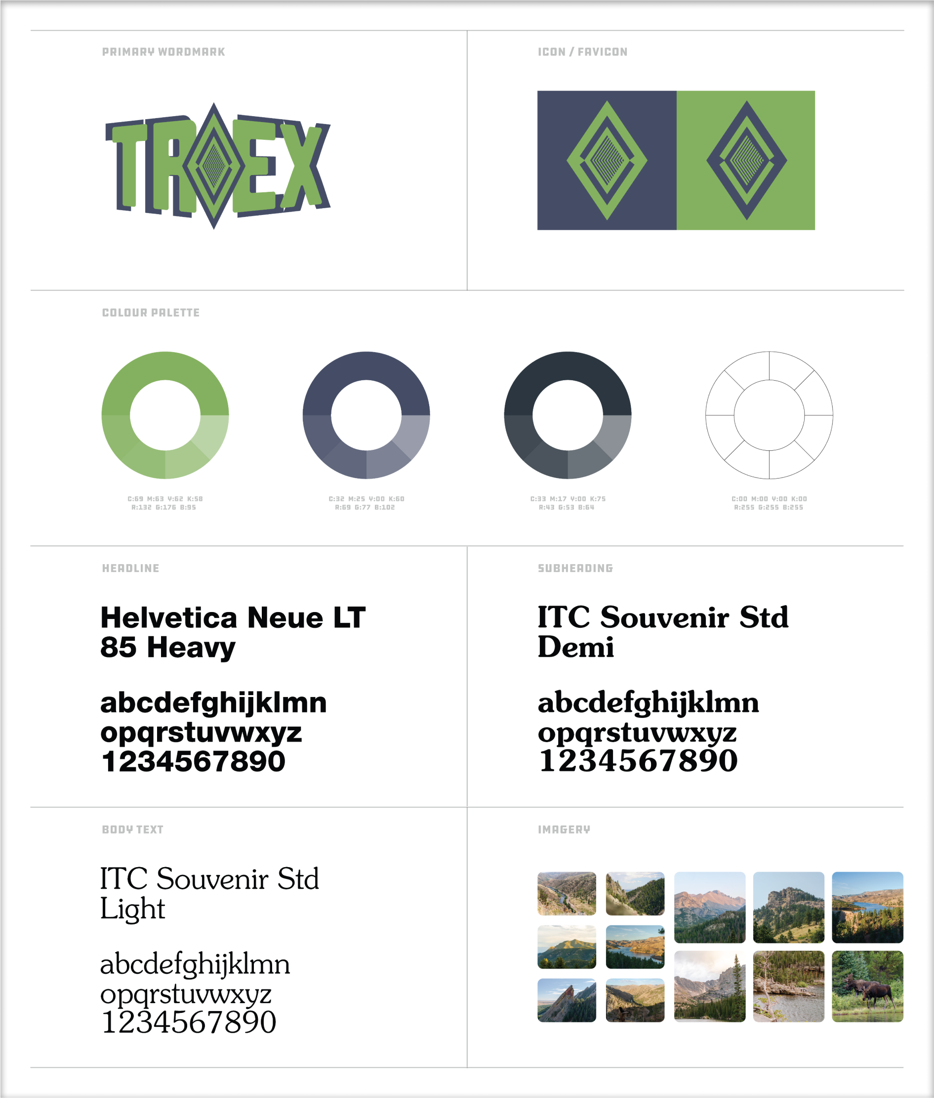
The goal of Trex as an overall brand is that of an informed, inviting and clear user experience of all. The main goal of Trex is to aid in helping users get from point A to point B as effortlessly as possible, for any potential users. Additionally, the main icon/favicon diamond is a trail maker shape object with two inner arrows pointing inward to the last inside 'trail marker' shape.
The above all lends to the brand's overarching message of being there for users upon the exploring or discovering of new outdoor trails to utilize around them. With that being said, Trex’s tagline would be to ‘explore any trail, with a new found confidence’.
I decided to create custom illustrated signage, activity markers, Icons, and more. All constructed from scratch and using adobe illustrator to build out these vector objects.
How to maximize the amount of real estate or areas available to display all the necessary information needed here. For example a way of displaying, with full transparency, of where the applications information and/or data is collected from is key as well. Being able to search in map view or list view, by a designated activity is paramount to increased ease of access of users.
My main goal here was to allow users the chance to freely explore and discover at the same time, without interruption or having to close one to enter the other. Both can be used in tangent relatively when it comes to collapsable areas being featured here. Additionally this can even aid unfamiliar users being able to effectively search or and uncover new trails to get users outdoors. In the end, Trex is a companion mobile application, utilizing data of local resources to display any and all trails in their area, or around them.
The need for users to effortlessly and intuitively explore the application, and without fear of becoming lost. Also as to not to ever be forced to exit an area or screen, a layout or structure should be made. Getting lost in an application that was constructed to help aid in finding, traversing, or exiting a trail is not helpful. Because it is counterintuitive to Trex and its ideals as a whole.
Allowing users to simultaneously explore either the map-view, explore screen, with use of an active search bar together with use of any current route already underway was essential. So I built out this structural layout, in which multiple areas are all within reach of these single screens.
I created a high-fidelity, & interactive prototype in Figma to conduct usability testing, in person as well as through screen sharing. Four participants from various backgrounds, profiles & ages were chosen for the test. I presented each with 3 tasks to complete, then observed progression.
INSTRUCTIONS: "Please pretend you are exploring this map-view screen to find areas around you in which to potentially hike."
NOTES: Every participant enjoyed the overall presentation displayed, design layouts, branding, colors and more throughout.
INSTRUCTIONS: "I would like you to locate and start the trail routing for the designated recreational trail."
NOTES: Each user effortlessly located the direct action buttons on top of the trail detail page, and even selected the currect routing icon as well.
View Prototype
I made a list of iterations based on feedback from my testing. This made me reflect upon the importance of testing as a part of the overall design process, as well as how the process is interactive.
Presentation of available trails nearby could be improved with inclusion of possible filters or sorting, to help narrow down potential options. For example, perhaps through a certain desired trail activity results can be given, or even a direct CTA button for most popular activities.
Exploration is a key concept when it comes to Trex, as a whole and as a tool to aid in finding a user the perfect trail for the activity they are looking to enjoy. With that in mind the explore screen allows for breaking down of searching by an activity, popular areas, top trails nearby, and/or by search bar results.
Users often attribute a good online shopping experience or situation on how straightforward, quick & easy the entire process is for them, from start to finish.
Active summary sidebar to accompany users throughout their entire checkout process, as well as the pages in there of. Yet, this whole process is reserved to only three screens. Finally, the entire user progress till complete l throughout can be tracked & navigated effortlessly.
1 - Build out additional mobile app pages & features, adding to the prototype.
2 - Undergo another, more extensive round of usability testing, time permitting.
3 - Package & prepare all deliverables to hand to potential developers.
A companion application to aid individuals in safely exploring various outdoor trails and to further enjoy a variety of activities thereof is paramount. With that being said, almost all agree that the best trails are those that are well marked, be it with signage and clear postings. Additionally, upfront labeling in the allowance of dogs on a given trail was of high priority to many users as well.
Much confusion arose from people viewing trails without a proper distance being labeled, as well as it being either a loop or one way path. In conclusion, I discovered early on that a majority of users felt trying out new hikes or areas kept them continually interested and exploring the outdoors.